Tutorial Two
qCal Graphs and Calculations
Tutorial navigation
Diffusion Phantom Graphs & Calculations
Breast phantom Graphs & Calculations
Go to tutorial II »
Section I. Diffusion Phantom Graphs & Calculations
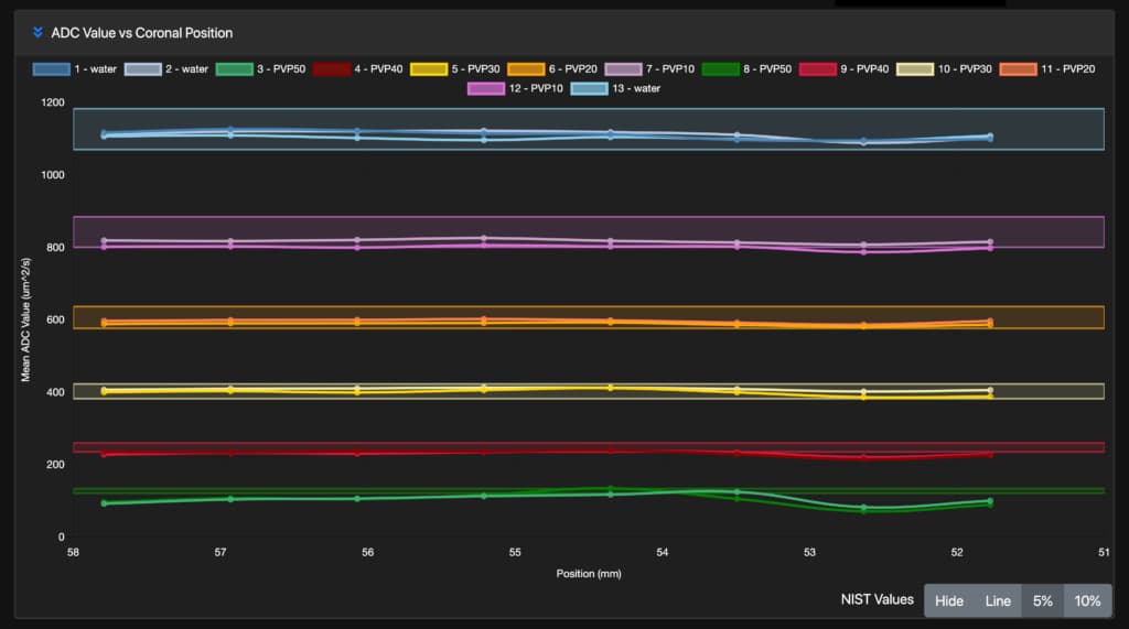
i. ADC Value vs. Phantom Position
On this graph, you can view how your imaging phantom data compares to the NIST traceable dataset and if your data is within a certain margin of the NIST values.
There are five ways to view and manipulate this data:
- You may hide the NIST values by clicking the “Hide” button in the bottom right corner of the graph.
- You may introduce the average “line” by clicking the “Line” button on the bottom right corner of the graph.
- You may introduce a 5% margin by clicking the “5%” button on the bottom right of the graph.
You may also hide certain data lines, such as PVP40, to isolate the vial data you are prioritizing. You can do this by clicking on the vial label in the legend.
ii. NIST ADC Value vs. Measured ADC Value
iii. B-value vs. SNR
iii. DWI SNIR B0 Value vs. Phantom Position
Tutorial navigation
Diffusion Phantom Graphs & Calculations
Your Title Goes Here
Your content goes here. Edit or remove this text inline or in the module Content settings. You can also style every aspect of this content in the module Design settings and even apply custom CSS to this text in the module Advanced settings.
Your Title Goes Here
Your content goes here. Edit or remove this text inline or in the module Content settings. You can also style every aspect of this content in the module Design settings and even apply custom CSS to this text in the module Advanced settings.
I. How to view expected & recommended protocols
II. Download qCal protocols
III. How to access the QIBA conformance protocol for DWI certification
Go to tutorial II »
Section II. Breast Phantom Graphs & Calculations
i. ADC Value vs. Phantom Position
On this graph, you can view how your imaging phantom data compares to the NIST traceable dataset and if your data is within a certain margin of the NIST values.
There are five ways to view and manipulate this data:
- You may hide the NIST values by clicking the “Hide” button in the bottom right corner of the graph.
- You may introduce the average “line” by clicking the “Line” button on the bottom right corner of the graph.
- You may introduce a 5% margin by clicking the “5%” button on the bottom right of the graph.
You may also hide certain data lines, such as PVP40, to isolate the vial data you are prioritizing. You can do this by clicking on the vial label in the legend.
ii. NIST ADC Value vs. Measured ADC Value
iii. B-value vs. SNR
iii. DWI SNIR B0 Value vs. Phantom Position
iv. NIST ADC Value vs RC
v. Random Error Value vs Coronal Position
vi. NIST ADC Value vs wCV
vii. T1 SNR Value vs Coronal Position
Tutorial navigation
Diffusion Phantom Graphs & Calculations
Your Title Goes Here
Your content goes here. Edit or remove this text inline or in the module Content settings. You can also style every aspect of this content in the module Design settings and even apply custom CSS to this text in the module Advanced settings.
Your Title Goes Here
Your content goes here. Edit or remove this text inline or in the module Content settings. You can also style every aspect of this content in the module Design settings and even apply custom CSS to this text in the module Advanced settings.
I. How to view expected & recommended protocols
II. Download qCal protocols
III. How to access the QIBA conformance protocol for DWI certification
Go to tutorial II »
Section III. System Phantom Graphs & Calculations
i. Normalized Fiducial Sphere Intensity
On this graph, you can view how your imaging phantom data compares to the NIST traceable dataset and if your data is within a certain margin of the NIST values.
There are five ways to view and manipulate this data:
- You may hide the NIST values by clicking the “Hide” button in the bottom right corner of the graph.
- You may introduce the average “line” by clicking the “Line” button on the bottom right corner of the graph.
- You may introduce a 5% margin by clicking the “5%” button on the bottom right of the graph.
You may also hide certain data lines, such as PVP40, to isolate the vial data you are prioritizing. You can do this by clicking on the vial label in the legend.
ii. Distance From Central Sphere vs Left/Right Distortion
iii. Distance From Central Sphere vs Anterior/Posterior Distortion
iii. Distance From Central Sphere vs Superior/Inferior Distortion